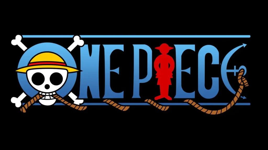
Meaning behind the ONE PIECE Logo
The One Piece logo has intrigued fans for years, and while its true meaning remains a mystery, there are several interesting theories.
Let’s explore a few:

1-Geographical Representation:
Some fans believe that the logo depicts elements of the One Piece world map. Here’s a breakdown:
The text itself represents the Grand Line, the mysterious and treacherous sea where the story unfolds.
The lines above and below the text symbolize the Calm Belts, which surround the Grand Line.
The O with crossbones could represent Reverse Mountain, where the bones’ ends mark the entrances from each of the Blues.
The red “Luffy I” could signify the Red Line, which separates the world into four seas.
The anchor remains a point of speculation—some suggest it represents the end of the journey or even a treasure map.
2-Joy Boy Connection:
Luffy being depicted as the Red Line might imply that JoyBoy, a mysterious figure from the Void Century, had something to do with its creation.
The gigantic straw hat under Mariejois (which some believe belonged to JoyBoy) adds to this theory.
3-World Impact:
Another interpretation is that the crossbones represent Road Poneglyphs, and the “O” stands for Laugh Tale (the final island).
The Straw Hat symbol plastered over the logo could signify the crew leaving their mark on the world.


